Micro Magic is a Vancouver Island-based company redefining mornings through psilocybin-infused coffee.
At the core of our offerings is a carefully crafted blend that includes a 5–10% microdose of psilocybin, paired with functional mushrooms like Reishi, Cordyceps, and Lion’s Mane. This unique combination is designed to elevate your morning routine, promoting focus, clarity, and overall well-being, all while delivering the rich aroma and timeless taste of premium coffee.
We believe in the transformative potential of microdosing, not just for enhancing daily productivity but also for fostering a deeper connection to wellness. By integrating the healing properties of functional mushrooms with the benefits of psilocybin, we offer a mindful and innovative alternative to conventional coffee rituals.
Driven by a mission to better the human condition, Micro Magic is committed to pushing the boundaries of the microdosing industry. Our vision is to empower individuals with a product that seamlessly combines tradition with innovation, helping our customers start their day with intention and vitality.

Key Imagery
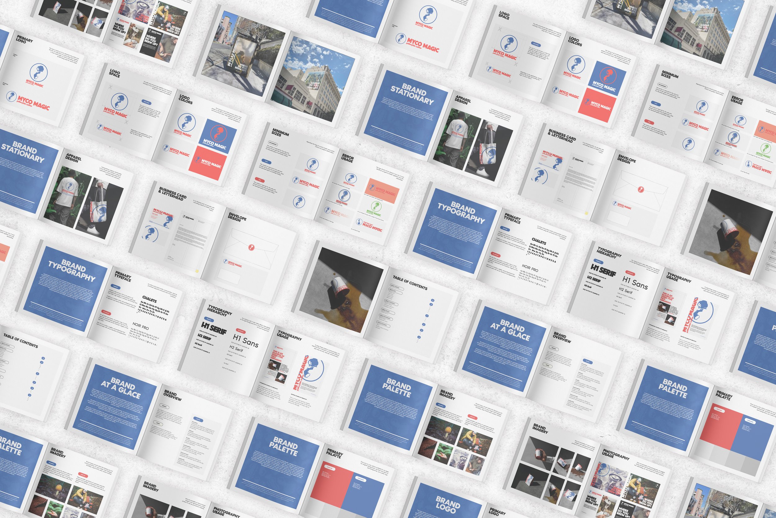
Starting with rough sketches, I explored different visual ideas for Myco Magic, which helped me pinpoint a style aligned with the brand's identity. This process clarified the direction for key elements like color palette, typography, and patterns, setting a strong foundation for a cohesive brand strategy.
By refining the brand's visual language early on, I’m now positioned to create a unified look and feel that resonates with Myco Magic’s audience and strengthens its presence across all brand touchpoints.

Logo & Branding
The Logo System is a vital component of the brand’s identity, comprising the primary logo, variations, and guidelines for usage.
The following system I created for Myco Magic ensures visual consistency across all applications, reinforcing brand recognition and integrity. By providing clear specifications for size, placement, and color, the logo & branding allows for flexibility while maintaining a cohesive look.
This consistency will not only distinguishes the Myco Magic in a crowded marketplace but also fosters trust and familiarity with their clients, making the logo an essential asset in building a lasting brand presence.
Photography & Social Media
Using consistent imagery on social media is key to reinforcing your brand identity. I’ve supplied Myco Magic with example photography & reusable graphics that will help maintain a unified visual style across posts whether through color schemes, filters, or photos, you create a cohesive experience that helps followers instantly recognize your brand.
This consistency not only strengthens brand recall but also establishes a sense of professionalism and trust. In a platform where visuals are consumed rapidly, a distinct and recognizable aesthetic helps your brand stand out, keeping it top of mind for your audience and building stronger connections over time.


Merch & Uniform
Incorporating company merchandise in your brand colors fosters a sense of organization and professionalism that resonates with customers. While working with Myco Magic to establish cost effective yet efficient apparel for the crew to wear we landed on using the a solid white as the fabric colour so we could place the logo mark and in bold contrasty colours on the shirt and Tote
When clients see employees adorned in cohesive, branded apparel or accessories, it not only enhances the visual identity of the business but also instills confidence in its reliability and expertise. This uniformity creates an immediate association between the brand and a commitment to quality, signaling to customers that they are engaging with a professional and organized company.
By proudly showcasing your brand colors, you reinforce your identity and create a memorable impression that can strengthen customer loyalty and trust.


